react-modalとMaterial UIの導入と使い方を簡単に解説します。
インストール
適当なプロジェクトを作り、そこでReact ModalとMaterial UIをインストールします。
$ npm install --save react-modal
$ yarn add react-modal
公式はこちら
https://github.com/reactjs/react-modal
https://reactcommunity.org/react-modal/
$ npm install @mui/material @emotion/react @emotion/styled
$ yarn add @mui/material @emotion/react @emotion/styled
公式はこちら
https://mui.com/material-ui/getting-started/overview/
モーダルを表示
React Modalの公式ページのサンプルコードをベースにモーダルを作成し、テキストやボタンはMaterial UIを使用します。
import { useState } from 'react';
import Modal from 'react-modal';
import { Box, Button } from '@mui/material';

export default function App() {
  const [modalIsOpen, setModalIsOpen] = useState(false)
  const modalStyle = {
    content: {
      top: '80px',
      left: '120px',
      right: '120px',
      bottom: '80px',
    }
  }

  return (
    <Box mt={3} ml={3}>
      <Button
        variant="contained"
        onClick={() => setModalIsOpen(true)}
      >
        Open
      </Button>
      <Modal
        isOpen={modalIsOpen}
        style={modalStyle}
      >
        <Button
          variant="outlined"
          onClick={() => setModalIsOpen(false)}
        >
          Close
        </Button>
      </Modal>
    </Box>
  )
}
モーダルの仕組みとしては、ボタンクリック時に[isOpen]のtrueとfalseを切り替えることで、開閉するというものです。
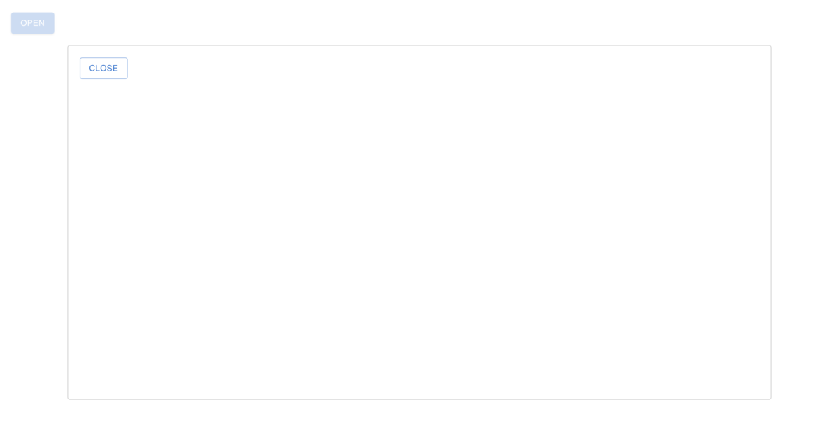
こんな感じで、モーダルができました。
別コンポーネント化
コードが長くなり、可読性が失われる場合があるので、別コンポーネント化します。[isOpen]の値はpropsを利用して親から子へ受け渡しましょう。
// App.tsx import { useState } from 'react'; import { Box, Button } from '@mui/material'; import { SampleModal } from './SampleModal';export default function App() { const [isOpen, setIsOpen] = useState(false) const sampleModalIsOpen = () => { setIsOpen(true) }
return ( <Box mt={3} ml={3}> <Button variant="contained" onClick={sampleModalIsOpen} > Open </Button> <SampleModal isOpen={isOpen} setIsOpen={setIsOpen} /> </Box> ) }
// SampleModal.tsx import Modal from 'react-modal'; import { Button } from '@mui/material';export const SampleModal = (props: any) => { const modalStyle = { content: { top: '80px', left: '120px', right: '120px', bottom: '80px', } }
const modalIsClose = () => { props.setIsOpen(false) }
return ( < Modal isOpen={props.isOpen} style={modalStyle} > <Button variant="outlined" onClick={modalIsClose} > Close </Button> </Modal> ) }
便利なAPI
最後にいくつか紹介して終わりにします。
onAfterOpen={}
onAfterClose={}
それぞれモーダルを開いた時と閉じた時に実行する関数を設定できます。
style={}
見た目の設定ですね。
